History of the Puma Logo

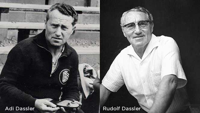
Puma (formally known as PUMA AG Rudolf Dassler Sport) is recognized for its best performance, design oriented athletic shoes and other sportswear. Unlike many of its competitors however, the branding story behind this sportswear titan is one riddled with scandal, war and sibling rivalry. Unknown to many, Puma Founder Rudolf Dassler’s brother was none other than Adi Dassler, creator of the Adidas brand. The pair were former partners in the Dassler Brothers Shoe Factory , which skyrocketed to fame in 1923 when many of the athletes taking home Olympic medals were wearing a little-known brand of shoe from a small Bavarian town in the countryside.

The brothers had been making shoes long before the business was launched. Their first prototypes were fashioned in the family wash room, as they experimented with different materials and techniques to provide the most durable and performance-ready shoe the world had ever seen. Both athletes and huge sports fans, the pair had an affinity for their trade that few possess, along with a competitive spirit which would simultaneously fuel their dreams, and drive a wedge in between them.
The Fall
As discussed in History of the Adidas logo The Dasslers’ fallout was a gradual one compounded over time by differing political opinions. The two got into a heated argument which culminated in mutual disownment. From this fallout a bitter feud was spawned - one that would shake up the quiet town of Herzogenaurach for decades. The company was broken up and Rudolf set himself to the task of building a new factory from scratch on the other side of town.
Branding: The Ultimate Competition
As lifelong men of sport, Rudolf and his brother were constantly pushing themselves to be better and business was no exception. Each of them had created an immense and growing demand for their products, with very little advertising or fanfare. They both understood one simple fact - there was no better publicity than putting your shoes on the world’s top athletes and watching them decimate the competition. It spelled certain victory to whoever could leave their mark on such conquest. The race was now on for each brother to distinguish himself with a winning brand.
In 1948 Adi launched Adidas, and Rudolf launched Ruda. At least that’s what it was initially called before he decided on Puma.
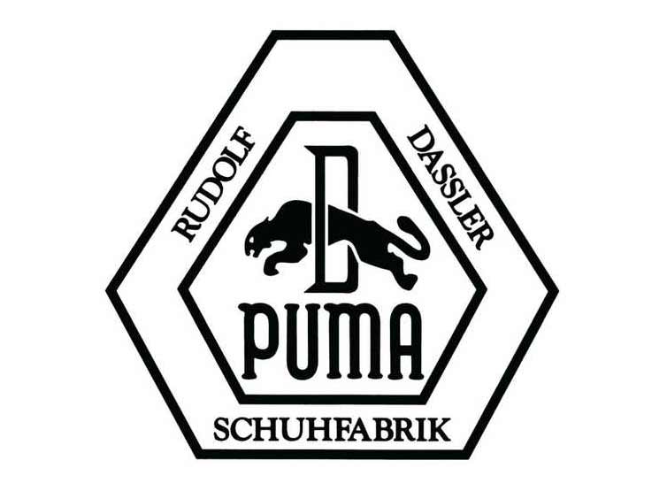
The name proved to be a fortuitous choice, not only because it translated well across many languages, but for the implied speed and power of its mascot. Active both day and night, the puma a powerful beast and an expert hunter that can jump to a maximum of 20 feet high in a single bounce. From the very start this bouyant idea would take center stage in the logo’s design. The puma is seen above in its first iteration, leaping through a capital “D” for Dassler.
Tweaking the Font
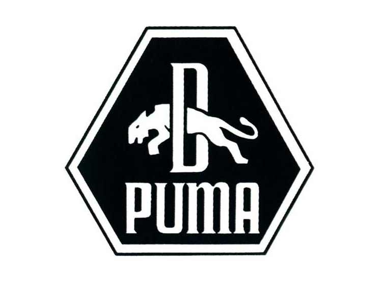
In 1957 Rudolf introduced a thicker, sans serif typeface that bears more resemblance to the modern wordmark. The squared off corners, and tall profile of this font is instantly recognizeable, save the small hints of serifs adorning the bases and caps. He also removed his name from the logo, along with the outer border - opting for a more minimal and simplified representation of the brand.
The Formstrip
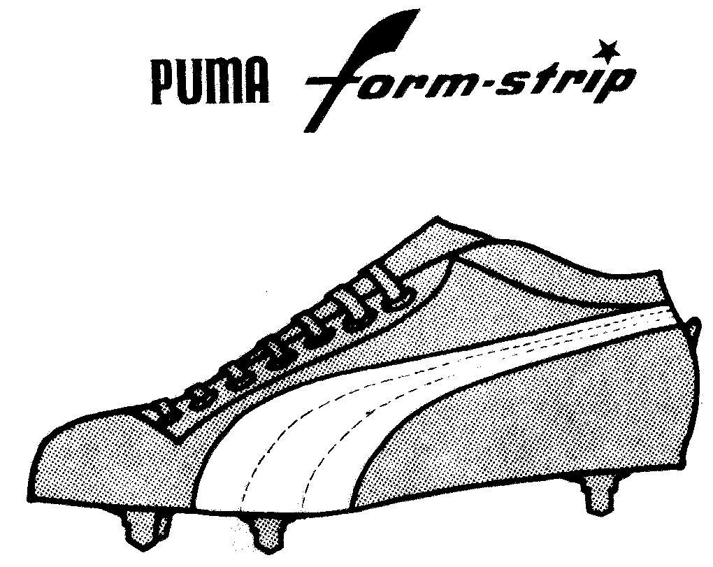
In 1958 Puma trademarked their formstrip - an ever expanding band of color that extended from the heel of the shoe, before diving into the soles along the sides. This particular shape was one born of practicality as it helped stabilize the shoe. Over time however, Rudolf’s pragmatic approach would pay dividends in the form of a simple icon which not only made his shoes functionally superior, but played into the established visual narrative of leaping predators.
To the Victor Go the Spoils
In 1960 Puma paid German sprinter Armin Hary to wear Pumas in the 100 metre sprint final. Hary had worn Adidas before and asked Adi for payment, but Adidas rejected this request. The German won gold in Pumas, but then laced up Adidas for the medals ceremony, to the shock of the Dassler brothers. Hary hoped to cash in from both, but Adi was so enraged he banned the Olympic champion.
Never one to be deterred, Rudolf would prove relentless in his quest for elite talent, eventually signing an endorsement deal with Brazilian soccer legend Pelé. By associating its brand with A-list champions, Puma would continue to innovate on its products.
The Puma Icon
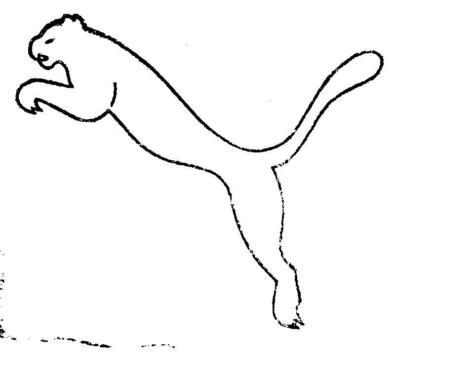
In 1967 Puma was performing well in the sportwear sector and sought to expand its brand for casualwear and mainstream markets. As such, a new puma icon was created by Lutz Backes, a cartoonist from Nuremberg, who opted for stark minimalism in his rendering of the iconic feline. This is the emblem we still recognize today - a testament to the efficiency and durability of its design.
No. 1 Logo
1968 would see more Olympic gold for the company. Tommie Smith and John Carlos, would make headlines with their salute to black power in solidarity with oppressed peoples of color, a gesture they made wearing Pumas. The pattern of success would continue through the 1970’s as Puma signed endorsement deals with high-profile athletes in basketball, track & field and tennis.

In 1971 the company opted for a design which had appeared on a few of their star offerings, like the PUMA Clyde shoes (named after basketball legend Walt “Clyde” Frazier). In this particular iteration the puma is seen leaping onto the wordmark itself - a clever interaction of elements which further drives home the idea of playing or just living at another level when you wear Pumas. This would become the standard logo and has remained so ever since.
The Puma Legacy
Rudolf passed away in 1974, leaving behind a vast sportswear empire and a brand which would prove to be timeless. The feud between the brothers’ factories and factions in their home town would eventually fizzle out, with an official truce being declared in 2009 thanks to a friendly soccer match. Today both companies continue their fierce competition and the race to secure the most promising athletic talent has not slowed down. Puma continues to dominate the Olympics and add top-shelf performers to its roster, like Usain Bolt.
Fine Print Art is an educational independent research publication. The above content has not been officially sponsored by PUMA SE.
How FinePrintArt.com Maintains Its Ad-Free Creative Platform
FinePrintArt.com is a unique platform developed and maintained by Fine Print New York, experts in the restoration of antique, rare & damaged wallpapers. This collaboration allows this website to offer insightful, ad-free content on creative artists and the evolution of visual branding. Fine Print's expertise in restoring vintage designs directly informs the rich, well-researched articles found here, showcasing our commitment to both historical preservation and contemporary artistic exploration.
Meet the Founders: The Creative Minds Behind Our Platform
Joseph Gornail a distinguished printer/photographer and the visionary behind Fine Print New York, hails from SoHo, Manhattan. Rooted in a family tradition of NYC printing, Joseph mastered the craft as a teenager. His significant impact on the New York printing industry ignited in 1996 with Dolo Records/Stretch Armstrong. He founded All City Marketing & Printing in the late '90s and co-created the iconic streetwear label Orchard Street with partners Benjamin Holloway and Greig Bennett in 1999. In 2004, Joseph launched Fine Print NYC, establishing it as a leading commercial printing firm. The company debuted with a landmark project for Nike, epitomizing innovation and resilience in the modern digital landscape.
Steven Garcia a prominent designer/illustrator and creative director at Fine Print, originates from Bushwick, Brooklyn. A graduate of Fashion Industries High School and the Fashion Institute of Technology (F.I.T.), Steven has carved a notable path in the design world. His early career highlights include a role as a sought-after professional retoucher and storyboard artist at Saatchi & Saatchi in 1996. Embracing his entrepreneurial side, Steven founded ShinyDesign in 1998, which later became a key design partner for Fine Print NYC in 2004. His extensive portfolio features collaborations with elite brands such as Snapple, The Waldorf Astoria, Netflix and Sony, cementing his status as a key influencer in New York's vibrant advertising & design industry.