History of the Pepsi Logo

Pepsi is one of the most globally recognized logos in the world. Its rich history spans over a century and its current form is the culmination of many changes - a constant exercise in progressive minimalism as the company strives to keep its image relevant for every generation.

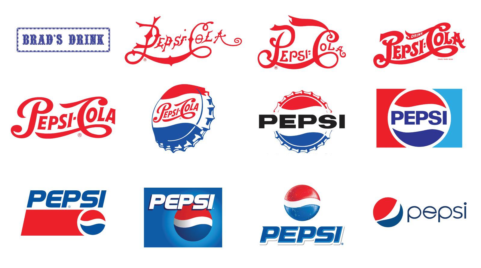
Probably the most surprising aspect of Pepsi’s brand is that it wasn’t always called Pepsi. In 1893, a pharmacist named Caleb Bradham created a beverage made of sugar, water, caramel, lemon oil, nutmeg, and other natural additives. He sold it at his pharmacy in New Bern, North Carolina under the name “Brad’s Drink” which enjoyed instant local success.
Pepsi Cola is Born

On August 28, 1898, Bradham renamed his drink “Pepsi-Cola”. He peddled his drink as more than mere refreshment, but a healthy beverage, aiding in digestion and boosting energy levels. He also knew he needed a new name to achieve mainstream success. By this time, Coca Cola had already become an overnight sensation, so it’s not surprising that he wanted to go in a very similar direction.
1905 Rebrand

In 1905 the brand would undergo its first revision, clearly an attempt to make the logo more legible and smooth. The use of a bolder script font and elimination of ornamental decorations ensured a much stronger brand presence.
1906 Rebrand

The script font is modified and made bolder for more simplicity. At this time the company touted the slogan, “The Original Pure Food Drink.”, which is why the word “Drink” was also incorporated into the wordmark. This particular version would prove to endure longer than any of its predecessors, remaining unmodified for almost four decades.
1940 Rebrand

It is now 1940 and Pepsi Cola has grown into an international brand. During an era where the concept of global marketing and branding is becoming more commonplace, the creative team is ready for another logo revision. The font still uses serifs but they are minimized, along with any decorative flair that may have survived from earlier iterations.
1950 Rebrand

In the wake of World War 2, patriotic feelings in the United States are at an all-time high. With the addition of blue, a patriotic color palette is attained, along with an iconic bottle camp which would endure for 12 years.
1962 Rebrand

The logo was updated to read simply “PEPSI” in a bold, sans serif font, this time superimposed on the classic bottle cap but from a straight perspective, making the logo more symmetrical and iconic. It’s also around this time that “Pepsi Generation” as a concept is pushed via radio spots and song writing contests.
1973 Rebrand

The success of the previous logo has now been distilled to a bare minimum. The same font is used but the classic bottle cap has been hyper minimalized within this famous boxed-in version of the company’s brand. This is also the first time a third color is added, with sky blue becoming a staple of the logo and marketing materials.
1987 Rebrand

While the visual layout from 1973 is preserved, this is the first time Pepsi uses an unconventional and modern custom typeface that will help the company’s image as innovative and future-minded.
1991 Rebrand

Pepsi is thinking outside the box, liberating both its wordmark and bottlecap icon from the previous layout and letting them exist in their own spaces. The custom font has also been tweaked with a 12 degree italic slant, another visual indication of the company’s forward thinking and vision.
1998 Rebrand

Striving towards more boldness and simplicity, Pepsi eliminates the red box completely so the wordmark and icon stand out more. The move towards a blue as the dominant color also helps distinguish the brand from other competitors.
2003 Rebrand

The turn of the millennium has come and gone and the Pepsi logo has been updated with pseudo-serifs reminiscent of its 1940 rebrand, along with some subtle 3D shading.
2006 Rebrand

The wordmark is moved below the circle and the colors are swapped while the icon itself is given further 3D treatment in the form of ice and condensation, a visual hint of how refreshing the beverage can be.
2008 Rebrand

In probably the boldest departure of previous styles, Pepsi unleashes a lower case wordmark in a thin, sans serif font and distorts the cap icon by stretching it over a sphere - a nod to the company’s reach as an global purveyor of commerce and culture.
2014 - Present

In 2014, even more simplicity is achieved as designers opt to remove the blue line around the circle, allowing it to carve its white center from the surrounding negative space.
Conclusion
It’s pretty amazing how far the branding has come over the last century, having seen the logo change colors and fonts. It’s pretty clear that Pepsi has never been afraid to reinvent itself over and over again, while still remaining a global brand.
Fine Print Art is an educational independent research publication. The above content has not been officially sponsored by Pepsico Inc.