Apple's Evolution: From Garage Start-Up to Tech Giant & Brand Icon
The History and Evolution of Apple’s Iconic Logo
Beyond Apple’s epic legacy of innovative products lies an equally compelling history of corporate identity. One should expect nothing less from the company that helped to transform the industrial landscape and usher in a new age of personal computing - a foundation upon which so many businesses thrive today.
Where Apple Got Its Name
Apple’s co-founder Steve Wozniak discusses the inspiration behind the name in his 2006 book “iWoz: Computer Geek to Cult Icon”
“I was driving Steve Jobs back from the airport along Highway 85. Steve was coming back from a visit to Oregon to a place he called an ‘apple orchard’. It was actually some kind of commune. Steve suggested a name – Apple Computer. The first comment out of my mouth was, ‘What about Apple Records?’ This was (and still is) the Beatles-owned record label. We both tried to come up with technical-sounding names that were better, but we couldn’t think of any good ones. Apple was so much better, better than any other name we could think of.”
And just like that, a billion dollar brand was born. Wozniak’s concerns turned out to be merited however, and in 1978 Apple Corps sued the company for copyright infringement. The suit would be settled 3 years later for an undisclosed amount. In the end it turned out to be a minor setback which didn’t seem to slow down this burgeoning company.
The Apple Orchard Connection
Interestingly, the “apple orchard” Jobs visited wasn’t just any commune. It was the All-One Farm, an apple orchard and commune in Oregon that was part of the Back to the Land movement of the 1970s. Jobs had spent time there during a period of soul-searching before co-founding Apple. This connection between Jobs’ personal journey and the company’s name adds an intriguing layer to Apple’s origin story, linking the tech giant’s birth to the counterculture movement that was reshaping American society at the time.
Alternative Names Considered
While “Apple” ultimately won out, Jobs and Wozniak did consider other names. Some of the alternatives they brainstormed included:
- Executek
- Matrix Electronics
- Personal Computers Inc.
These more technical-sounding names reflect the nature of the product but lack the simplicity and approachability that “Apple” conveyed. The choice of “Apple” was a deliberate move away from the cold, corporate image of existing computer companies, aligning with Jobs’ vision of making computers friendly and accessible to everyone.
Wozniak and Jobs had developed a revolutionary personal computer built around a screen and pointing device which stood in radical contrast to the console-based computers and word processors of the time. In tandem with this feat of engineering, they would continue to develop the Apple brand, eventually referring to their invention as ‘Macintosh’ - a particular variety of which Steve Jobs was fond, especially during his famous phase of frugivore dieting.
By this point it was becoming clear: big things were brewing in an understated garage on Crist Drive in Los Altos, California which would serve as Apple’s first base of operations.

The Garage Myth
While the garage at 2066 Crist Drive in Los Altos is often cited as the birthplace of Apple, Steve Wozniak has since clarified that its role in Apple’s early days has been somewhat mythologized. In a 2014 interview with Bloomberg Businessweek, Wozniak stated:
“The garage is a bit of a myth. We did no designs there, no breadboarding, no prototyping, no planning of products. We did no manufacturing there. The garage didn’t serve much purpose, except it was something for us to feel was our home.”
This revelation doesn’t diminish the humble beginnings of Apple but rather highlights how powerful the garage startup narrative has become in Silicon Valley lore.
The Creation and Development of Apple’s Famous Icon
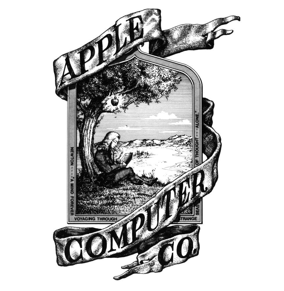
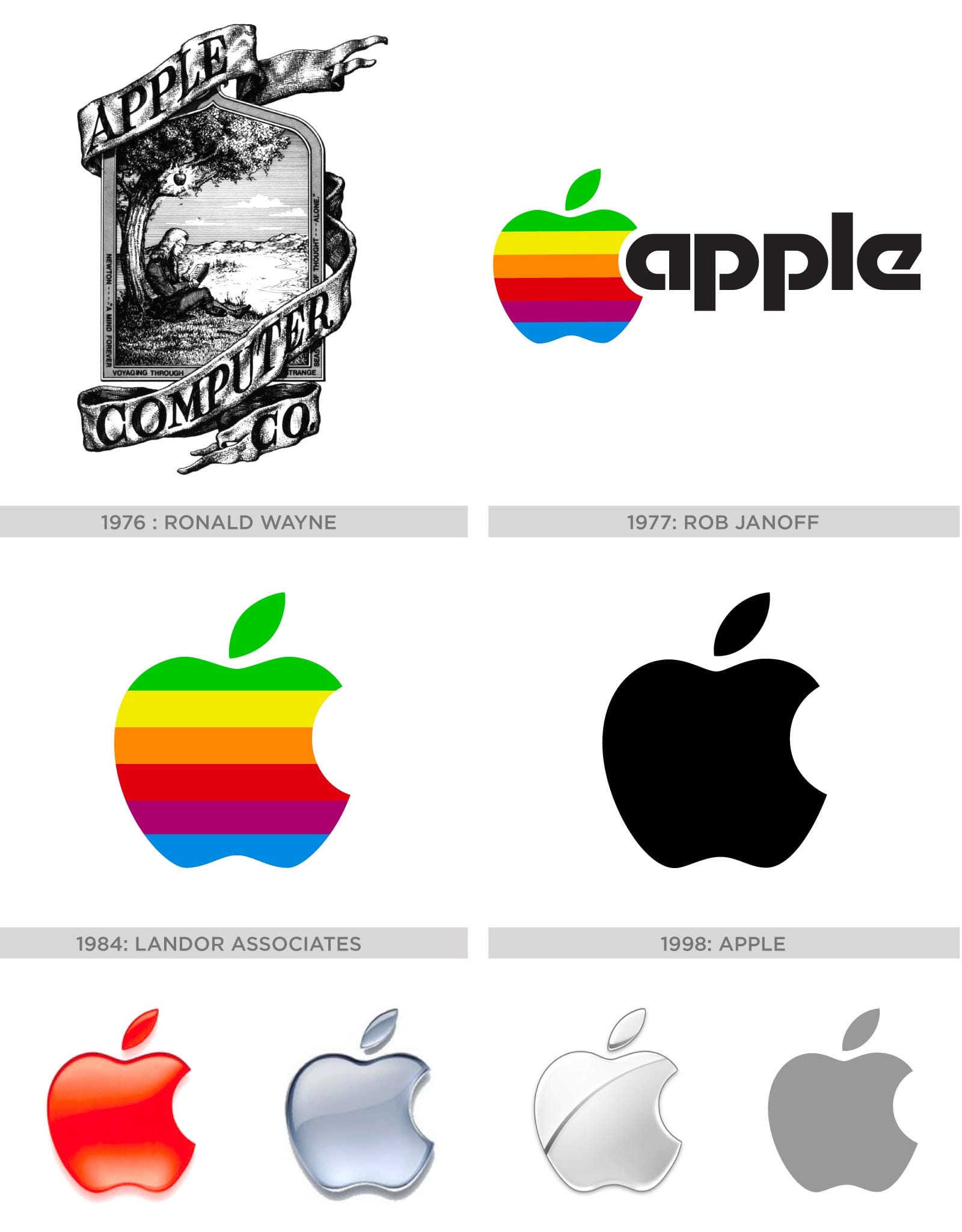
The first Apple logo was designed by Steve Jobs and Ronald Wayne in 1976, featuring Isaac Newton sitting under an apple tree. It was inspired by a quotation by Wordsworth that was also inscribed into the logo that said: “Newton… a mind forever voyaging through strange seas of thought” with ‘Apple Computer Co.’ on a ribbon banner ornamenting the picture frame.
The Short-Lived Newton Logo
This original logo, often referred to as the “Newton Crest,” was used for less than a year. Despite its short lifespan, it encapsulated several key elements that would remain central to Apple’s brand identity:
- The connection to knowledge and discovery (symbolized by Newton)
- The apple as a central motif
- A sense of artistic and literary inspiration (the Wordsworth quote)
However, Jobs quickly realized that this intricate design was difficult to reproduce at small sizes and didn’t convey the modern, approachable image he envisioned for Apple.
It was a good start, but in the end Steve wasn’t 100% convinced so in 1977 he commissioned designer Rob Janoff to focus more on the apple itself. At the time Janoff was an Art Director at Regis McKenna, a vanguard design firm which would not only develop Apple’s corporate identity, but also write a full business and marketing plan for the fledgling company.
In the end Janoff did not disappoint and history was made as he delivered the iconic logo we know so well, albeit a more colorful version dubbed the “rainbow apple” which was accompanied by a bold and modern sans-serif font.

The Rainbow Apple: A Stroke of Genius
Janoff’s creation of the rainbow apple logo was a masterstroke of design that perfectly aligned with Apple’s brand values and the technological capabilities of their products. Here are some fascinating details about this iconic design:
-
The rainbow colors weren’t just aesthetic: They were chosen to showcase the Apple II’s color display capabilities, a significant selling point at a time when most computers could only display monochrome graphics.
-
Specific color order: The colors were specifically ordered with green at the top, mimicking the leaf’s color. This attention to detail helped make the apple instantly recognizable as an apple, despite its stylized design.
-
One-hit wonder: Remarkably, Janoff created only one design concept for Apple. Jobs immediately approved it without requesting any changes, a rarity in the world of corporate logo design.
-
Hidden meaning in the bite: While many have speculated about the meaning of the bite, Janoff has stated it was primarily a scale thing, to ensure that at small sizes the shape would still be recognizable as an apple rather than a cherry.
-
Designed for longevity: Despite being created in 1977, the basic shape of Janoff’s apple has remained unchanged for over four decades, a testament to the timelessness of his design.
Since then the logo endured small iterations over the years. Landor Associates eliminated the wordmark in favor of the icon in 1984. It would later take on a stark black look in 1998, followed by more polished 3D versions and finally the flat/white or gray versions we see today.
The Monochrome Era and Beyond
The shift to a monochrome logo in 1998 marked a significant change in Apple’s visual identity, coinciding with the company’s resurgence under the returned leadership of Steve Jobs. This change reflected several factors:
-
Sleeker product design: The monochrome logo complemented the more refined, minimalist design of products like the iMac G3 and later the iPod.
-
Cost-effective branding: A single-color logo was cheaper to reproduce across various media and products.
-
Versatility: The monochrome design allowed for greater flexibility in how the logo could be used across different applications and materials.
-
Maturation of the brand: Moving away from the rainbow colors signaled Apple’s evolution from a quirky startup to a serious, premium tech brand.
The subsequent iterations of the logo, including the glossy 3D version introduced in the early 2000s and the flat design adopted in 2013, have each reflected contemporary design trends while maintaining the core shape established by Janoff.
Myths, Speculation & Symbolism
The Apple brand was such a massive success that it would invite constant speculation as to its meaning or purpose.
One of the most popular theories came from artists and authors like Sadie Plant of Zeroes and Ones, who considered the Apple logo as an homage to Alan Turing who was persecuted for his homosexuality and committed suicide by eating a cyanide-laced apple. Turing was the father of modern computing, and revolutionized the overlapping fields of math, science and technology with his published paper “On Computable Numbers”.
The Turing Connection: Myth and Reality
While the connection between Apple’s logo and Alan Turing is a compelling narrative, it’s important to note that this was not the original intention behind the design. However, the association has taken on a life of its own:
-
Embracing the myth: Despite not being the original inspiration, Apple has not shied away from the Turing connection. In 2011, the company altered its logo to feature a rainbow design in honor of Gay Pride, indirectly acknowledging the Turing association.
-
Turing’s rehabilitation: In 2009, then-Prime Minister Gordon Brown made a public apology for Turing’s treatment by the British government. In 2013, Queen Elizabeth II granted him a posthumous pardon. These events brought renewed attention to Turing’s story and its perceived connection to Apple’s logo.
-
Pop culture reinforcement: The 2014 film “The Imitation Game,” starring Benedict Cumberbatch as Turing, further popularized his story and indirectly strengthened the perceived connection to Apple’s brand in the public imagination.
Others would draw inevitable comparisons to the Garden of Eden, where Eve took a bite from a forbidden fruit. It’s an attractive idea, particularly when one considers the fruit was picked from the Tree of Knowledge, granting her wisdom of the gods as she gave in to temptation of the talking serpent.
This idea was bolstered by the fact that some of Apple’s earliest prototypes were sold for $666.66. Apple tech service manager Archie D’Cruz elaborates on this in his detailed response to a question on Quora:
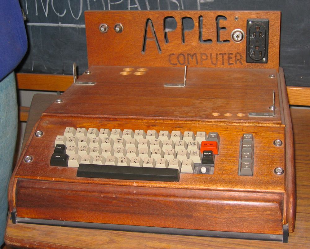
“Each computer cost Jobs and Wozniak about $250 to put together and they decided to offer it to the store at the wholesale price of $500. Retail price would be about a third more, which came to $666.66. Wozniak said that as a mathematician, he liked repeating numbers, so instead of rounding it up, that’s the figure they went with.”
The $666.66 Price Tag: Debunking the Myth
While the $666.66 price tag has fueled much speculation about hidden meanings or occult references, the reality is much more mundane and speaks to the practical, somewhat whimsical nature of Apple’s founders:
-
Wozniak’s fondness for repeating digits: As a programmer, Wozniak had an affinity for patterns in numbers. He has stated that he simply liked the repeating digit aesthetic of $666.66.
-
No connection to the biblical “Number of the Beast”: Both Wozniak and Jobs have consistently denied any intentional reference to the biblical connotations of 666.
-
A marketing accident: The unconventional price point generated buzz and free publicity for Apple, an unintended but welcome side effect.
-
Practical considerations: The price was a simple markup calculation based on component costs and desired profit margins, with no deeper symbolic meaning intended.
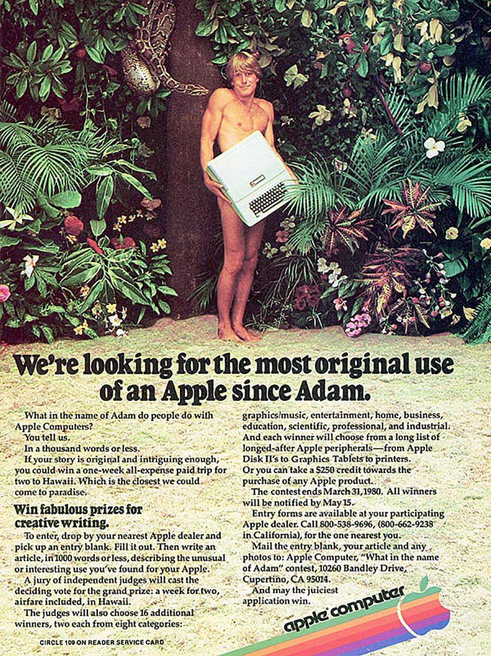
The concept wasn’t lost to Apple’s marketing team either, which made playful references in some of their earliest advertisements.
When you think about it the humble apple carries a lot of symbolic power, presenting itself throughout history as the center of many stories and traditions.
In Greek mythology, immortality can be found in the Garden of the Hesperides , where nymphs gain eternal life by eating golden apples which are guarded by a dragon with a hundred heads. The entire Trojan war itself was also indirectly spawned by a divine fight over a golden apple which was provoked by Eris, goddess of dischord.

Today, everyone knows the story of Snow White and aside from modern lore, apples form a significant part of our rituals and vernacular. Whether you are bobbing for them on Halloween, presenting one to a teacher as a gift or simply eating one a day to keep the doctor away, it is clear that notions of health, wisdom and temptation are common associations.
It’s difficult to pinpoint exactly why this is the case. Perhaps it’s the polished appearance, the contrast of skin color. Maybe it’s the uniquely satisfying crunch from that first bite. Whatever the case apples never failed to captured both our appetites and imaginations, making it an ideal symbol for a popular product.

The Biting Truth
Despite all speculation and theories, the reasoning behind Apple’s logo was a lot more practical according to Janoff, who apparently used the bite for clarity’s sake to represent the appropriate scale.
From his interview with Forbes Magazine
“The apple shape itself didn’t have anything to do with computers. It’s to get people to notice that an Apple computer was not some piece of hard-edged metal that has no place in your home and that your kid wouldn’t want to be near. Lots of different fruits have a stem, are sort of round with a leaf dangling off of it. So the bite in the apple was initially meant to indicate that it was an apple, and not something else. Also metaphorically the bite indicated biting into all the knowledge users would get out of this computer.
What’s funny, though, is after I came up with it my creative director, Chip, said “Oh guess what, Rob. You just designed something you didn’t realize. The word ‘byte’ is a computer word. And you took a bite out of Apple.” I wasn’t computer literate enough to see that initially. And I was like, there’s a bit of wit that will last! Any logo that makes a joke or engages you in that way you’re going to remember. And the rainbow colors had to do with the USP of this product. The Apple computer was the only one that could show images in color.”
Steve Jobs expressed some regret that such parallels were not drawn in the conceptual stages. When asked directly by writer/actor Stephen Fry if the logo was inspired by Turing he said “God we wish it were. It’s just a coincidence.”
The Continued Search for Meaning
Even today the speculation continues. Apart from the symbolism of the logo some artists have visually analyzed the logo’s design. Probably one of the more interesting studies is by graphic designer Thiago Barcelos who applied the Fibonacci sequence, or Golden Ratio as the underlying structure of the logo. His work illustrates one of the more subliminal reasons why Apple’s brand may have endured the test of time, despite its famously rapid pace of innovation. The folks over at Edible Apple Blog poked a bit of fun with this idea, creating a mockup of what current Apple products might look like with the old rainbow logo.
The Golden Ratio and Apple’s Design Philosophy
The application of the Golden Ratio to Apple’s logo, while likely unintentional in the original design, aligns well with Apple’s overall design philosophy:
-
Attention to Detail: Apple’s products are known for their meticulous design, often incorporating subtle mathematical and geometric principles.
-
Aesthetic Harmony: The Golden Ratio is often associated with natural beauty and aesthetic perfection, qualities that Apple strives for in its product design.
-
Subliminal Appeal: Even if not consciously recognized, the use of pleasing proportions can make a design more appealing to viewers.
-
Design Legacy: The possible presence of the Golden Ratio in Apple’s logo connects it to a long tradition of design and art, from ancient Greek architecture to Renaissance paintings.
-
Myth-Making: The idea that Apple’s logo incorporates the Golden Ratio has become part of the company’s mystique, regardless of whether it was an intentional design choice.
Easter Egg: How to Type the Apple Logo with Your Keyboard
On Mac OS, hold down the Shift and Option keys then press the letter ‘K’, and a postscript version of the font will appear, sized down and scaled to whatever block of text you are writing.

iOS devices also have the font baked in but it is not as accessible with a keyboard shortcut. Thankfully, there is a workaround which will allow you to summon the icon at will.
Windows users can open the Character Map app. Press Windows+R keys from keyboard to open Run window and then type the word charmap and hit Enter. Select font face “Baskerville Old Face” from Font drop-down menu. Scroll-down a bit and you’ll see Apple logo in the characters list. Select the Apple logo symbol, hit the “Select” and then “Copy” buttons to copy the Apple character to clipboard.

The Apple in Culture and Commerce
The apple’s rich symbolic history has made it an ideal choice for branding beyond just Apple Inc. Here are some interesting examples of how the apple has been used in other commercial and cultural contexts:
-
The Big Apple: New York City’s nickname, popularized in the 1920s, is thought to have originated from horse racing slang where the prizes, or “big apples,” were awarded at NYC racecourses.
-
Apple Records: The Beatles’ record label, founded in 1968, used a Granny Smith apple as its logo. This led to a series of trademark disputes with Apple Computer that weren’t fully resolved until 2007.
-
Apple Bank: Founded in 1863 as the Haarlem Savings Bank, this New York-based bank rebranded as Apple Bank in 1983, leveraging the apple’s associations with New York City.
-
Applebee’s: The restaurant chain, founded in 1980, uses an apple in its logo, playing on the wholesome, all-American associations of the fruit.
-
Apple Vacations: This tour operator, founded in 1969, uses an apple to symbolize the sweetness and desirability of vacation experiences.
These examples demonstrate the versatility and enduring appeal of the apple as a symbol in branding and popular culture.
The Power of Simplicity: Apple’s Logo in Marketing
Apple’s logo has been a cornerstone of the company’s marketing strategy, embodying the power of simplicity in brand communication. The company’s advertisements often feature little more than the product itself and the Apple logo, a testament to the strength of both elements in carrying the brand’s message. This minimalist approach has become a signature of Apple’s visual identity, allowing the products to speak for themselves while the logo serves as a seal of quality and innovation.
![Collage of photos showing off a Sleek Macbook Pro]](/images/blog/history-of-apple-logo/apple-design.jpg)
The logo’s simple design has proven remarkably versatile, maintaining consistency across Apple’s diverse product range. From the tiny AirPods to the expansive screens of iMacs, the apple silhouette remains instantly recognizable, tying together Apple’s ecosystem of devices and services. This visual continuity has played a crucial role in building and maintaining Apple’s brand identity across decades of technological evolution.
In the retail space, Apple has leveraged its logo to create landmark destinations. Apple Stores often feature oversized, illuminated Apple logos that serve as beacons for consumers, instantly identifiable from a distance. These glowing apples have become synonymous with the sleek, modern aesthetic of Apple’s retail experience, drawing customers into spaces that feel more like interactive showrooms than traditional stores.
 Foster & Partners’ Apple Store sits right across Safdie Architects’ ArtScience Museum in Singapore
The Apple logo also plays a starring role in the company’s product launches and marketing events. The reveal of the logo often marks a climactic moment in these presentations, building anticipation and excitement among audiences. This strategic use of the logo underscores its emotional resonance with consumers and its power as a symbol of innovation and cutting-edge technology.
Even in brand partnerships, Apple’s logo often takes center stage, demonstrating the company’s dominant position in collaborative ventures. Whether it’s co-branded credit cards or partnerships with luxury fashion brands, the presence of the Apple logo signals a blend of technology and lifestyle that few other brands can match.
When Branding Bites Back: Apple’s Marketing Missteps
What’s A Computer?
Despite its reputation for marketing brilliance, even Apple isn’t immune to missteps. While the company’s advertising campaigns have often set industry standards, some have missed the mark, stirring controversy and backlash instead of the intended buzz.
One particularly contentious example was a 2017 commercial for the iPad Pro. The ad, titled “What’s a Computer?”, aimed to showcase the iPad Pro as a versatile device capable of replacing traditional computers. However, its execution left many viewers feeling alienated or upset.
The commercial featured a young girl using her iPad Pro for various tasks throughout the day. When a neighbor asks her what she’s doing on her computer, the girl responds with the now-infamous line, “What’s a Computer?” This attempt to position the iPad as the future of computing backfired spectacularly, with many viewers finding the child’s response disingenuous and the overall message condescending.
Critics argued that the ad came across as smug and out of touch, implying that Apple’s target audience was so young that they wouldn’t even recognize a traditional computer. The backlash was swift and widespread, with the commercial becoming a subject of ridicule on social media and even spawning parody videos.
Everything You Need
Another controversial campaign was the 2019 iPad Pro advertisement that showed various creative tools and musical instruments being crushed by a hydraulic press, only to be replaced by an iPad Pro. The ad’s tagline, “Everything you need to work and create, all in one device,” was meant to emphasize the iPad Pro’s versatility.
However, many viewers, especially artists and musicians, found the imagery of destroyed instruments and tools deeply unsettling. The ad seemed to suggest that traditional creative methods were obsolete, which struck a nerve with many professionals who still rely on and value these tools. The violent imagery of the hydraulic press crushing beloved instruments also felt at odds with Apple’s usually sleek and minimalist aesthetic.
Apple Rival Samsung, claps back with their ad campaign “Creativity Can’t Be Crushed”, featuring a girl playing a beat up old guitar but reading her music on a tablet.
These missteps serve as a reminder that even with a strong brand and a history of successful campaigns, companies can still make errors in judgment. They highlight the delicate balance that must be struck in marketing, especially for a company like Apple that has cultivated an image of innovation and forward-thinking. Pushing boundaries in advertising can be risky, and even a brand as strong as Apple isn’t immune to public backlash when their message misses the mark.
In the grand scheme of Apple’s marketing history, these controversial campaigns are outliers in a sea of successful and influential advertisements. They serve as valuable lessons in the importance of understanding and respecting your audience, even as you attempt to challenge and expand their perceptions of technology and creativity.
The Future of Apple’s Logo
As Apple continues to evolve and expand into new product categories, its logo remains a constant. However, the way this iconic symbol is used and perceived may adapt to new technologies and changing consumer expectations.
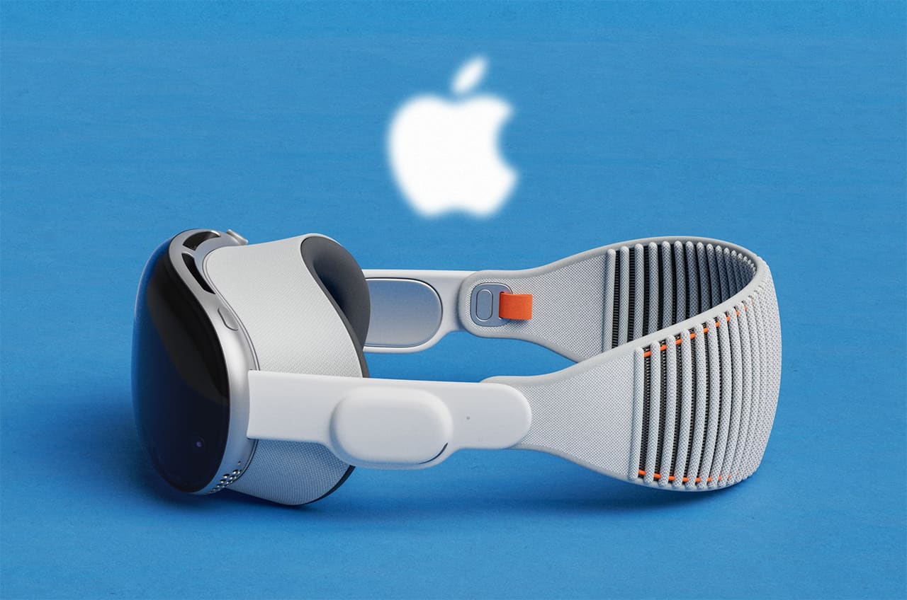
With Apple’s increasing focus on Augmented Reality (AR), we might see more dynamic, three-dimensional versions of the logo in digital spaces. Imagine an Apple logo that appears to float in mid-air or integrates seamlessly with your surroundings through an AR headset. This could open up new possibilities for interactive brand experiences, blending the physical and digital worlds in ways that reflect Apple’s position at the forefront of technology.
As devices become more personalized, the Apple logo might also become more adaptable. We could see versions of the logo that change color or finish to match user preferences or contexts. This adaptive approach could extend Apple’s philosophy of personal technology to its very brand symbol, allowing users to feel an even deeper connection to their devices.
Environmental concerns are likely to play an increasing role in brand perception, and Apple’s logo could evolve to symbolize the company’s commitment to sustainability. Perhaps we’ll see versions of the logo incorporated into recycling initiatives or crafted from sustainable materials in physical products, reinforcing Apple’s messaging around environmental responsibility.
The tactile experience of technology is another frontier where Apple’s logo might find new expression. On touchscreen devices, interacting with the Apple logo could trigger specific haptic responses, adding a tactile dimension to brand interactions. This could create a more immersive, multi-sensory brand experience that goes beyond visual recognition.
Finally, as artificial intelligence becomes more prevalent in our daily lives, the Apple logo might serve as an interface point for AI assistants or services. Imagine summoning Siri or accessing AI-powered features simply by interacting with the Apple logo on your device. This could position the logo not just as a brand symbol, but as a gateway to advanced technological capabilities.
In all these potential future directions, the core strength of Apple’s logo - its simple, instantly recognizable design - remains its greatest asset. As technology evolves, this elegant apple silhouette stands ready to take on new meanings and roles, continuing to represent Apple’s blend of innovation, design, and user-centric technology.
Summary
It’s incredible how far Apple has come since its humble inception nearly 40 years ago. Today few companies enjoy the enthusiastic fanbase that Apple does, and it is clear that their visual prowess plays just as big a role in their success as the industry-shifting technology they are known for cranking out.
One wonders if they would have enjoyed the same success under one of those alternative technical names that Jobs and Wozniak were kicking around on that fateful drive. It just hits home the importance of inspired marketing and presentation. Build the right brand and they will come.
The Apple logo’s journey from a complex illustration to a simple, instantly recognizable icon mirrors Apple’s own evolution from a garage startup to a global tech leader. Its enduring power lies in its simplicity, adaptability, and the myriad meanings and associations it has accrued over time. As Apple continues to shape the technological landscape, its logo remains a constant, silent ambassador for the brand’s values of innovation, design, and user-friendliness.
Historical Timeline of Apple’s Branding Evolution
1976: Apple’s first logo, designed by Steve Jobs and Ronald Wayne, featured Isaac Newton under an apple tree with a quote from Wordsworth. It represented knowledge and discovery but was too complex for mass reproduction, prompting a redesign.
1977: Designer Rob Janoff created the iconic rainbow Apple logo to reflect the Apple II’s color display capabilities. The bite in the apple ensured the logo wouldn’t be mistaken for a cherry, and the design was immediately approved by Jobs with no revisions.
1977-1980: The slogan “Byte into an Apple” was used in marketing materials. It cleverly played on both the logo’s visual identity and a reference to the technical term “byte” emphasizing Apple’s user-friendly yet sophisticated technology.
1981: The first print ad for the Apple II ran with the tagline, “We’re Looking For The Most Original Use Of An Apple Since Adam.” This bold statement highlighted the creative potential of personal computing in an era when the concept was still emerging.
1983: Apple’s campaign, “Soon There’ll Be Just Two Kinds Of People. Those Who Use Computers, And Those Who Use Apples” positioned the brand as an inevitable force in the burgeoning personal computing market, setting it apart from competitors with accessible, forward-thinking technology.
1984: The legendary “1984” Super Bowl ad, directed by Ridley Scott, introduced the Macintosh. This dystopian commercial painted Apple as a revolutionary brand breaking away from conformity, a defining moment in the company’s history and advertising.
1985: The Macintosh was marketed with the tagline, “The computer for the rest of us.” This emphasized ease of use and accessibility, key elements in Apple’s strategy to democratize personal computing, making it appealing to non-technical consumers.
1987: With “The Power To Be Your Best” campaign, Apple targeted professionals and creatives, cementing the Macintosh as a tool for artists, designers, and educators. This campaign reinforced the brand’s positioning in the creative industry.
1990: The “What’s on your PowerBook?” campaign promoted Apple’s first portable computer. It emphasized mobility and the idea that professionals could now take their work anywhere, which was groundbreaking at the time.
1994: Apple introduced the Apple Garamond font as its corporate typeface. This move created a cohesive visual identity, with the font being used consistently in all branding and product marketing, reinforcing Apple’s polished and professional image.
1997: The “Think Different” campaign was launched after Steve Jobs’ return to Apple. Featuring iconic figures like Einstein and Gandhi, it reinvigorated Apple’s image by associating the brand with innovation, creativity, and rebellious spirit.
1998: The iMac was introduced with the slogan “Hello (again).” The colorful, translucent design of the iMac broke with conventional beige computers, symbolizing Apple’s return to simplicity and user-centric design.
1999: The “iThink, therefore iMac” print ads played on the famous Cartesian quote, reinforcing the iMac’s philosophical and design-driven difference from its competitors, appealing to consumers looking for something beyond just another PC.
2001: With the “Rip. Mix. Burn.” campaign, Apple launched iTunes, positioning itself at the forefront of the digital music revolution. The slogan encapsulated the ease of copying, mixing, and burning music—activities that were becoming central to modern music consumption.
2002: The “Switch” campaign featured real people explaining why they switched from PCs to Macs, emphasizing the user-friendly experience of MacOS compared to the frustrations of Windows.
2003: The iPod silhouette campaign became instantly recognizable. The stark black silhouettes against vibrant backgrounds with white iPods and earbuds highlighted the ubiquity and cultural impact of the device, as well as its simplicity.
2004: The introduction of the iPod Mini came with the tagline, “1,000 Songs In Your Pocket.” This revolutionary concept redefined how people consumed music, further solidifying Apple’s dominance in the digital music market.
2006: The “Get a Mac” campaign, starring John Hodgman and Justin Long, humorously portrayed a Mac as cooler, friendlier, and more efficient compared to a dull, outdated PC. This campaign resonated widely, portraying Macs as fun and accessible.
2007: Apple introduced the iPhone with the slogan, “THis Is Only The Beginning” signaling a new era of smartphones. The iPhone revolutionized not only the mobile phone industry but the tech industry as a whole, with Apple now synonymous with innovation.
2008: The MacBook Air, advertised as the “World’s Thinnest Notebook” showcased Apple’s prowess in design and engineering. It was presented as a sleek, minimalist device for professionals on the go, highlighting Apple’s focus on portability without compromising performance.
2009: Apple filed for the trademark “THere’s An App For That” a phrase that became synonymous with the App Store’s vast ecosystem. It highlighted the transformative power of apps on mobile computing, where every task could be simplified with a tap.
2010: The iPad was introduced with the campaign “What is iPad?” marking the beginning of the tablet era. The ad focused on the iPad’s versatility and its potential to replace traditional laptops for certain uses, once again pioneering a new category.
2011: Siri, Apple’s voice assistant, was introduced with conversational ads that showcased its groundbreaking ability to understand and respond to natural speech, pushing forward the integration of AI in daily life.
2012: Apple switched from Myriad to Helvetica Neue as its corporate font, signifying a move towards a cleaner, more modern aesthetic that better matched its minimalist product designs and refined user interface.
2013: The “Designed by Apple in California” campaign emphasized Apple’s attention to detail and craftsmanship. It reaffirmed Apple’s commitment to quality and its heritage, at a time when the company was seen as a global leader in premium design.
2014: Apple’s “Shot on iPhone” campaign featured user-generated content, showing that even everyday users could create stunning photography. This reinforced the iPhone’s position as the go-to device for amateur and professional photographers alike.
2015: The Apple Watch was introduced with the slogan, “The Watch Is Here.” This positioned Apple’s wearable tech as both a functional and fashionable accessory, appealing to a broad consumer base beyond tech enthusiasts.
2016: The “Practically Magic” campaign for the iPhone 7 showcased features like its new camera capabilities and water resistance, highlighting Apple’s continuous innovation in refining smartphone technology.
2017: Apple launched the HomePod with the Spike Jonze-directed “Welcome Home” ad, showcasing the speaker’s superior audio quality and seamless integration with the Apple ecosystem, aiming to elevate home sound systems.
2018: The “Behind the Mac” campaign highlighted creatives using Apple products to make groundbreaking work, reinforcing the Mac’s status as a tool for professionals in industries like design, photography, and music.
2019: The “Privacy. That’s iPhone” campaign underlined Apple’s commitment to user privacy, differentiating itself from competitors in the tech space by emphasizing its secure hardware and software ecosystem.
2020: “Creativity Goes On” campaign during the COVID-19 pandemic showed how Apple products supported creativity and productivity, even in lockdown, reaffirming the brand’s role in adapting to new work and life challenges.
2021: Apple introduced San Francisco as its new corporate font, replacing Helvetica Neue. This bespoke typeface enhanced readability and visual consistency across Apple’s expanding range of devices and services.
2022: The “Relax, it’s iPhone” campaign highlighted the new safety features of iPhones, such as Crash Detection and Emergency SOS, positioning the iPhone as not just a tech gadget but a life-saving tool.
2023: Apple launched the “Wonder awaits” campaign for its Vision Pro headset, teasing the potential of augmented reality to transform both work and entertainment, signaling the company’s next leap into the future of personal technology.
Fine Print Art is an educational independent research publication. The above content has not been officially sponsored by Apple Inc.
How FinePrintArt.com Maintains Its Ad-Free Creative Platform
FinePrintArt.com is a unique platform developed and maintained by Fine Print New York, experts in the restoration of antique, rare & damaged wallpapers. This collaboration allows this website to offer insightful, ad-free content on creative artists and the evolution of visual branding. Fine Print's expertise in restoring vintage designs directly informs the rich, well-researched articles found here, showcasing our commitment to both historical preservation and contemporary artistic exploration.
Meet the Founders: The Creative Minds Behind Our Platform
Joseph Gornail a distinguished printer/photographer and the visionary behind Fine Print New York, hails from SoHo, Manhattan. Rooted in a family tradition of NYC printing, Joseph mastered the craft as a teenager. His significant impact on the New York printing industry ignited in 1996 with Dolo Records/Stretch Armstrong. He founded All City Marketing & Printing in the late '90s and co-created the iconic streetwear label Orchard Street with partners Benjamin Holloway and Greig Bennett in 1999. In 2004, Joseph launched Fine Print NYC, establishing it as a leading commercial printing firm. The company debuted with a landmark project for Nike, epitomizing innovation and resilience in the modern digital landscape.
Steven Garcia a prominent designer/illustrator and creative director at Fine Print, originates from Bushwick, Brooklyn. A graduate of Fashion Industries High School and the Fashion Institute of Technology (F.I.T.), Steven has carved a notable path in the design world. His early career highlights include a role as a sought-after professional retoucher and storyboard artist at Saatchi & Saatchi in 1996. Embracing his entrepreneurial side, Steven founded ShinyDesign in 1998, which later became a key design partner for Fine Print NYC in 2004. His extensive portfolio features collaborations with elite brands such as Snapple, The Waldorf Astoria, Netflix and Sony, cementing his status as a key influencer in New York's vibrant advertising & design industry.